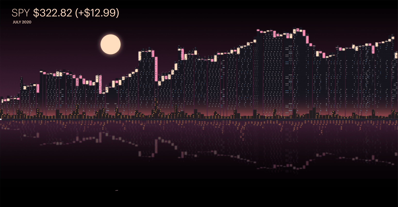
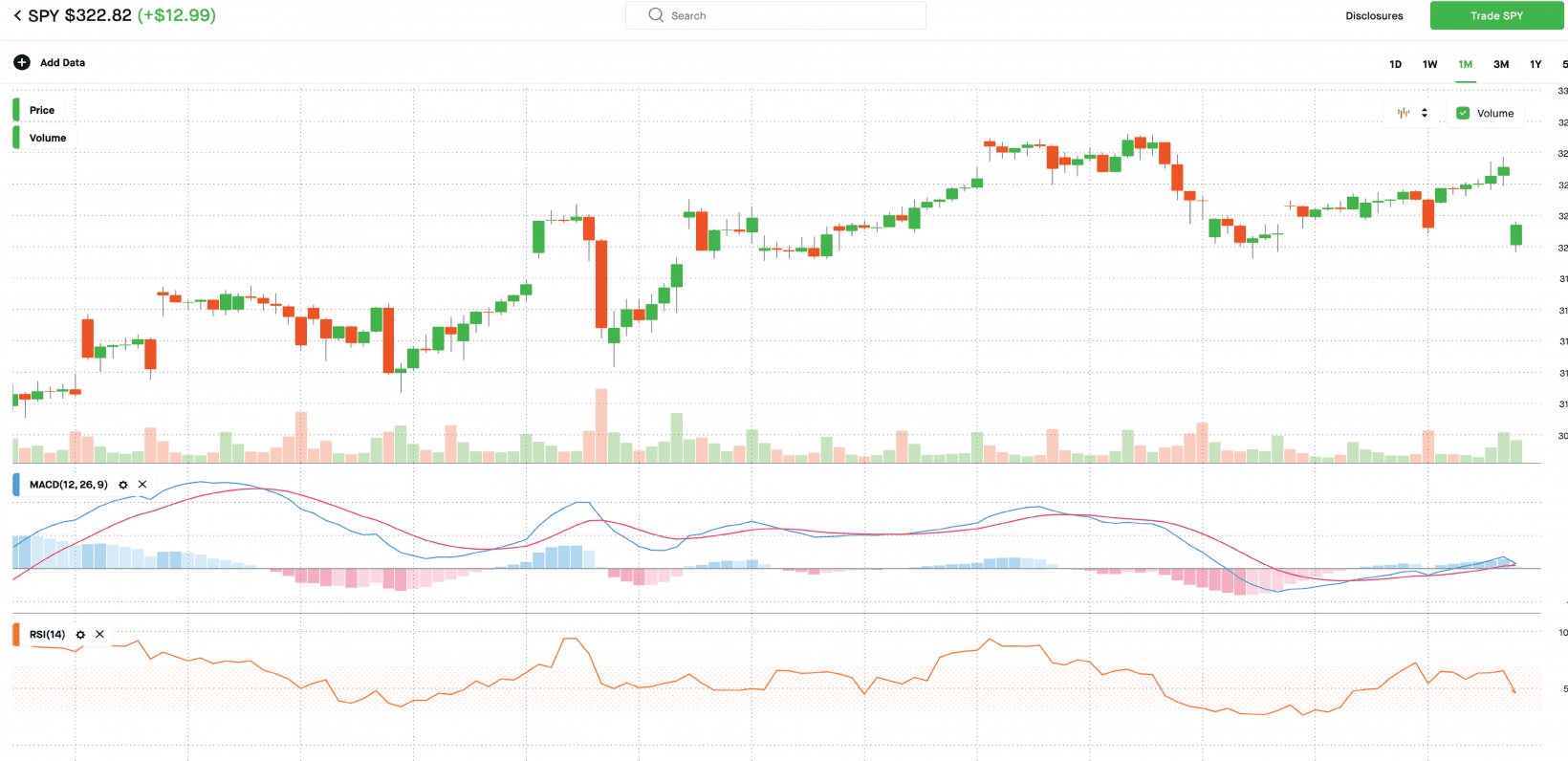
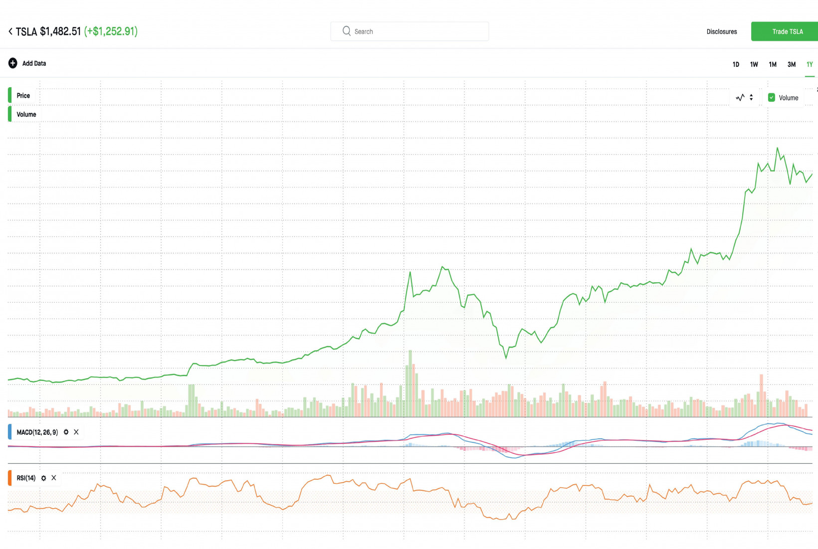
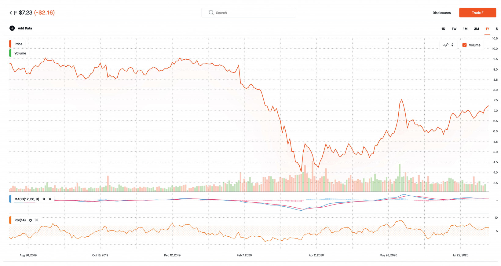
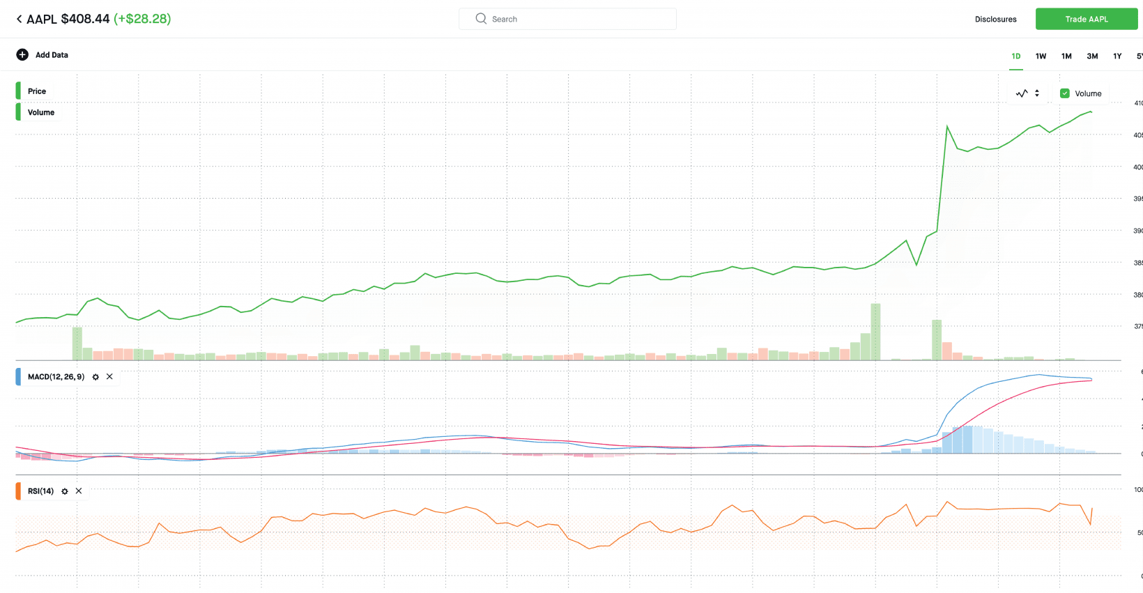
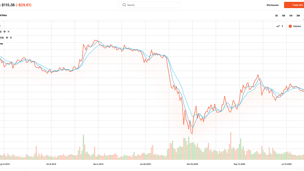
Stoxart is the work of Gladys, a self-described visual insights innovator mixing data with art to capture 2020’s monumentally volatile markets. Entirely hand-drawn with Adobe Illustrator’s pen tool, Gladys amplifies the context surrounding this year’s biggest stock storylines by transforming sharp price movements into jagged mountain skylines.
Stoxart has loads of Easter eggs for the stock market insider
Stoxart is a relatively new project, but it’s quickly gaining traction. Gladys’ latest work, inspired by automaker Ford’s chart, recently racked up more than 76,000 upvotes from the /r/dataisbeautiful subreddit. “I remember casually posting the Ford image, then sitting there in awe at how fast the upvotes were going,” Gladys told Hard Fork. “Each time I refreshed, it’d go up at least 10 more in that split second. I gained 600 followers in less than 24 hours, it’s insane. The best word to describe it is ‘overwhelming.’” Gladys peppers Stoxart with Easter eggs. Take the Tesla piece: a tiny Elon “lurks somewhere in the buildings,” and the trees are in the shape of Tesla logos. There’s even a Hyperloop that represents the trade volume of the company’s stock. [Read: Watch Tesla’s meteoric rise — set to techno-remixed Elon Musk tweets] As for what’s coming next: “I’ve been asked to do a lot of Tesla, Microsoft, S&P500, and Bitcoin is mentioned a lot as well,” said Gladys. “I’ve also been exploring the idea of combining two competing companies like AMD and Intel, so I think I have enough content to take me through the year.” Stoxart limited edition prints are available for purchase online, and the artist accepts commissions for custom work (including digital downloads). You can follow them on Instagram here.
